.png)
.png)

About
Site das Ferramentas is a Brazilian online store originally focused on tools and accessories for mechanics and auto detailing. Over time, its product line expanded to include items for construction, sports, leisure, and automotive fragrance. With Mercado Shops shutting down, the store needed a visual refresh and platform migration — fast.
My role was to lead the rebranding, streamline the UX, create a scalable system for Nuvemshop, and ensure a smoother shopping experience across all product categorie
Clients
Site das Ferramentas
Timeline
4 weeks
My Roles
Product & Brand Designer
Design Tools
Figma, Canva, Nuvemshop

The Challenge
Buggy checkout.
Big order abandoned.
One customer left a full cart behind after the site failed. Revealing it was time to migrate fast.
Platform Migration + Brand Uplift
With the imminent shutdown of Mercado Shops, Site das Ferramentas needed to quickly migrate their store while maintaining performance and trust. Their existing platform had also presented critical bugs — including one that caused a large order to be abandoned — revealing that a more reliable, scalable solution was overdue.
I presented various platforms, from Shopify and Wix to Brazil-based alternatives. We selected Nuvemshop for its integration with payment and logistics tools the client was already using (like MercadoPago and Melhor Envio).
Beyond functionality, the brand lacked visual consistency, SEO strategy, and accessible design. I led a full brand audit, followed by a custom rebranding and e-commerce setup optimized for both users and internal teams.
The Audience
Site das Ferramentas caters to a niche but passionate audience:
-
Automotive and construction professionals who rely on quality tools for daily work
-
DIY enthusiasts seeking reliable accessories and consumables
-
Small garage and detailing businesses aiming for cost-effective yet professional-grade equipment
-
First-time buyers who follow influencers partnered with Site das Ferramentas — and trust their recommendations
Whether it’s a professional detailer in São Paulo or a weekend bike tuner in Curitiba, our users expect clarity, speed, and confidence — both in product quality and in the online buying experience.

Brand Audit
From Where We Came
The old site, built on Mercado Shops, was functional but generic. Limited branding, buggy checkout, and inconsistent visuals held the store back. It wasn’t just about migrating — it was about reimagining the brand with clarity, consistency, and trust.
Old Website and Banners

The original site had minimal branding, outdated design elements, and visually inconsistent banners. The user experience felt cluttered and uninviting, with unclear hierarchy and little attention to aesthetics.


Brand Realignment
UI Inspiration

To Where We're Going
With the platform chosen and a clear brand audit in hand, it was time to reimagine Site das Ferramentas. Not just an online store — but a reliable, memorable brand with personality. I moved toward a visual identity that feels bold yet clean, a voice that’s helpful and direct, and a structure that’s ready to scale. From branding to product data, everything was designed to make growth easier, clearer, and more consistent.
Moodboard
The moodboard served as an anchor for tone, emotion, and design decisions — blending utility, boldness, and a touch of personality.

-
Trustworthy: Inspire confidence and credibility from the first click, with an emphasis on quality products and reliable delivery.
-
Approachable: Use simple, clear, and friendly language to connect with customers — no jargon, no complications.
-
Fast & Efficient: Convey a sense of speed and effectiveness — in both site navigation and product delivery.
-
Practical & Straightforward: Make the user journey seamless with intuitive navigation and objective information. Ensure the shopping experience is quick, clear, and easy to resolve.
-
Supportive: Position the brand as a daily ally for those who build, repair, or transform — always ready to help get the job doe.


Brand Realignment Goals
With a refreshed visual identity taking shape, it was time to translate that into a cohesive experience. But this wasn’t just about aesthetics — it was about aligning the brand with what it stands for and how it serves.
Building trust at every touchpoint, from homepage to checkout
Elevating the brand from generic to a specialized, reliable destination
Making room for growth with a visual system that could adapt across segments
Equip the team with easy-to-use templates and visual guidelines to maintain brand consistency across platforms.
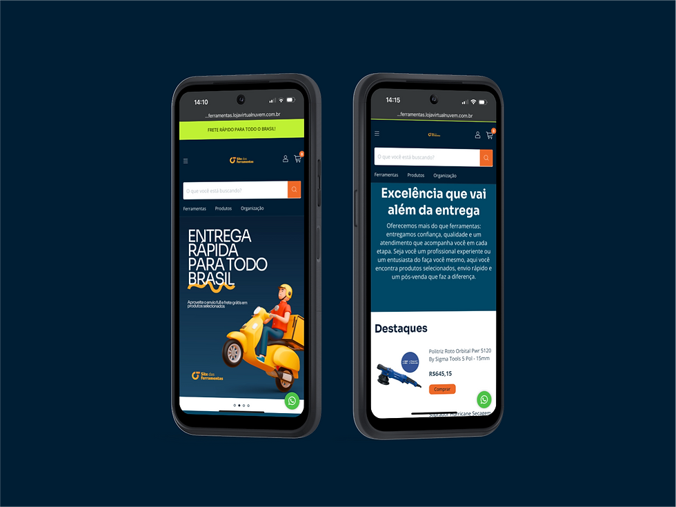
The Website
Website Design
While Nuvemshop doesn’t allow for deep customization, it proved to be the best platform for this client’s needs — offering robust integration with local payment solutions like Mercado Pago and shipping tools like Melhor Envio, plus a backend familiar to the client.
Knowing I’d be working within tight constraints, I selected a clean, flexible template that would allow for custom banners — creating visual space to inject personality, brand messaging, and product highlights.
I developed the initial set of banners and established a system in Canva so the internal team could create their own updates moving forward — with consistent typography, visual style, and messaging. This empowers them to highlight promotions, seasonal products, or campaigns like Father’s Day with ease.
Every banner was designed to balance brand voice, accessibility (contrast, hierarchy, clarity), and visual appeal — helping the store feel both professional and relatable.

Embedded Journey V1
For the embedded Sympla Insurance flow, I created a new section (#7) on the event creation page, seamlessly integrating the insurance option into the existing process. I used the same button style with a plus sign to maintain design consistency. When users click the button, a pop-up appears where they can easily fill out details about the person purchasing the insurance, whether it's for an individual or a business entity. This approach keeps the user experience smooth and intuitive, ensuring that adding insurance is a natural part of the event setup process.


Closing Remarks
Key Learnings
Rebranding and migrating Site das Ferramentas was not just a visual upgrade — it was a strategic evolution. Working within the constraints of a limited platform like Nuvemshop required creative problem-solving, technical know-how, and an empathetic understanding of both the client and their audience.
Some of the biggest takeaways:
-
Platform constraints are opportunities when paired with thoughtful content and design systems.
-
Clear processes and structure (like Drive templates, SEO frameworks, and Canva guides) empower small teams to maintain quality long-term.
-
Design goes beyond aesthetics — it’s about building clarity, trust, and confidence into every click.
Next Steps
The foundation is set. Moving forward, the team now has:
-
A scalable product structure to expand categories and improve discoverability.
-
A bold visual identity to stand out in a competitive online market.
-
Tools to create ongoing campaigns and updates independently.
As the brand continues to grow, there's room to:
-
Add blog or content areas to improve organic reach.
-
Explore CRM and marketing integrations.
-
Expand into new verticals (like sports and home improvement) while maintaining clarity through structured navigation.